
Hours speak louder,than logins
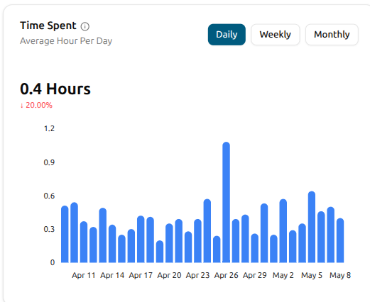
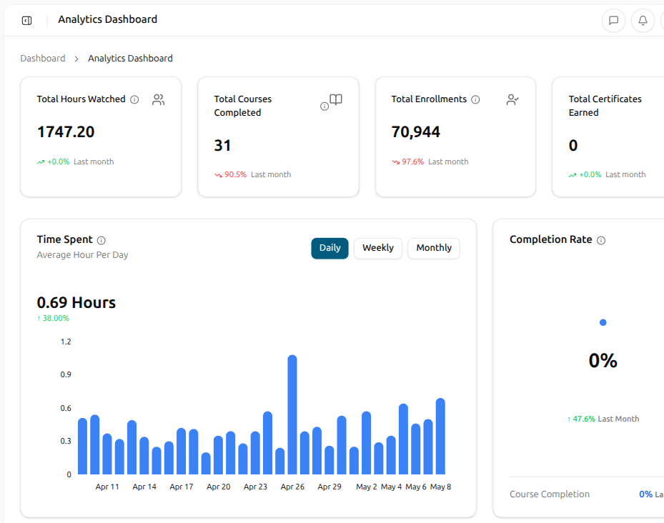
Anyone can sign in. The honest read on whether learning is happening is the time learners actually spend inside lessons. Edushade captures the seconds at the lesson, quiz and assignment level, rolls them up into a per-day aggregate, and surfaces the trend on one chart with a Daily / Weekly / Monthly toggle. The summary tile up top reads the current period's average hours per learner with the percent change against the previous period — the take-away in five seconds.
What's actually behind the time-spent chart
Time-spent isn't a vibe metric. The platform writes a time delta to a daily learning-time log every time a learner makes meaningful progress on content, and the trends view reads that aggregate. The summary tile is one number you can act on; the chart is the rhythm behind it.
Captured Per Lesson, Quiz and Assignment
Every progress record carries a time_spent in seconds. Video lessons track watch time. Quiz attempts track time from start to submission. Assignments track active session time.
Daily / Weekly / Monthly Toggle
Switch the chart between three granularities with one click. Monthly is the default — the right shape for a board update. Weekly fits a Friday review. Daily fits a release-week pulse.
Hours per Learner, Not Just Total
The chart plots hours per learner — total seconds divided by active learners in that period. The summary tile mirrors it. That's the figure that compares fairly across periods, not a raw total skewed by audience growth.
Period-Over-Period Delta on the Tile
The summary tile reads the current period's average hours per learner alongside a percent change against the previous period — up, down or flat, with a trend arrow. The take-away reads before the chart does.
Up to 24 Months of History
The endpoint accepts a months parameter from one to twenty-four. The default is twelve months, plenty for a quarterly read; bump it to twenty-four when you're sketching a longer arc.
Learner Dashboard, Day-by-Day
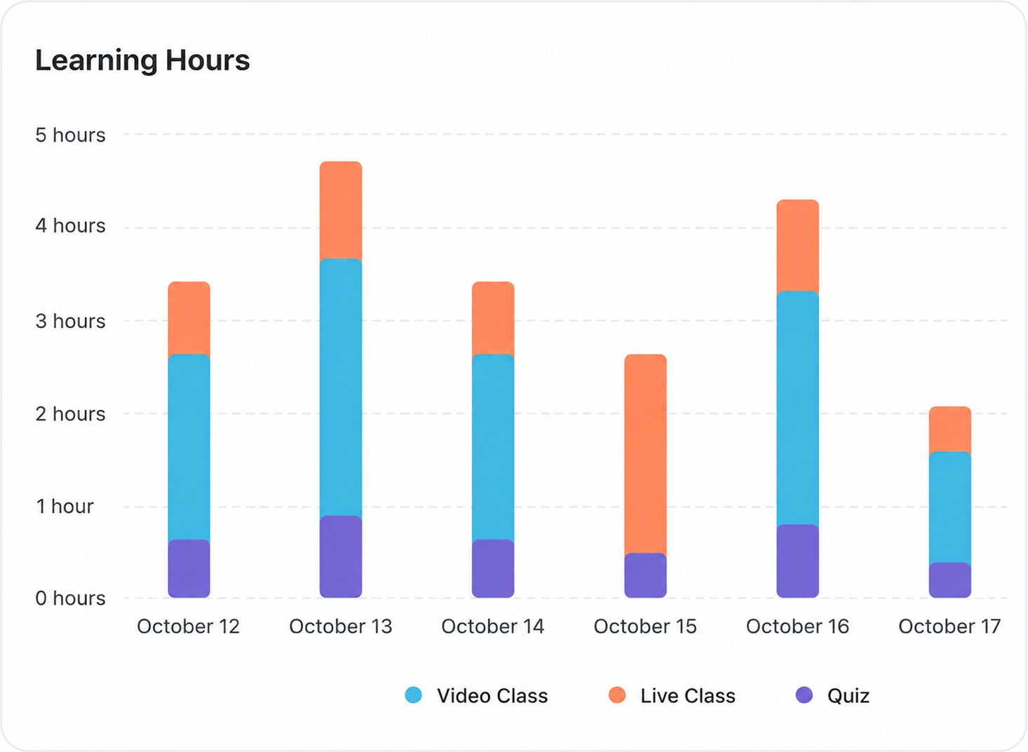
Each learner sees their own time on their dashboard — the last seven days as a stacked bar with separate slices for video lessons, live lessons, quizzes and assignments, plus a summary line for total time and days with activity.
Captured at the action, rolled up to the day
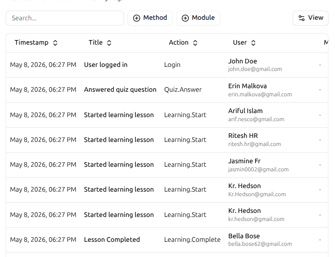
Every meaningful action a learner takes lands in a live activity log — logins, quiz answers, lesson starts, lesson completions — each row stamped with the timestamp, the action title, the action type and the learner. Filter by method or module to slice it. Those same actions roll up into the daily and weekly hours numbers — no separate pipeline, no reconciliation.
Live log with Timestamp, Title, Action and User on every row
Login, Quiz.Answer, Learning.Start, Learning.Complete and more
Filter by method or module to scope the view
Same actions feed the daily and weekly Learning Hours rollup
Three granularities, same data, one click between them
Three buttons sit above the chart — Daily, Weekly, Monthly. Pick any one and the chart redraws against that bucketing. Daily for a release-week pulse, Weekly for a Friday review, Monthly for a board-deck view. Same data, three lenses.
Daily, Weekly and Monthly views in one toggle
Headline shows period average with last-period change
Chart redraws on the click — no reload, no export
Hover any bar for the exact figure on that period
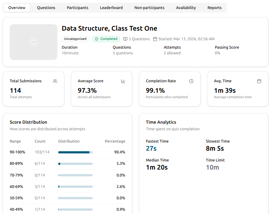
Per-quiz time analytics — fastest, slowest, median, vs the limit
Open any quiz's Overview and the time picture sits next to the score one. Fastest Time names the rocket who finished in 27 seconds. Slowest Time names the one who used almost the whole window. Median Time tells you what a typical learner actually took, and Time Limit is right there for instant comparison. Four numbers, five seconds, one decision — does the limit need adjusting?
Fastest, Slowest and Median Time on one card
Time Limit shown alongside for instant comparison
Avg. Time stat card up top — the one-glance number
Sits next to the Score Distribution on the quiz Overview
On the learner's dashboard too — broken out by what they did
Time-spent isn't only an admin view. Each learner sees their own Learning Hours chart on their dashboard — a stacked bar per day with separate slices for Video Class, Live Class and Quiz. They read their own week the same way an admin reads the platform — same shape, same source, no spreadsheet diff between the two.
Learner dashboard — Learning Hours, one stacked bar per day
Slices — Video Class, Live Class, Quiz
Hover any bar for the breakdown on that day
Same source data as the admin time-spent view
From a fresh enrollment to a clean read on hours
There's nothing to wire up. Time logs the moment a learner opens content. Open the trends view and the picture is there for today, this week, or the last twenty-four months.
Open the trends view
Jump to the Analytics Dashboard from the admin. The Time Spent chart sits in the page with its headline average and the change vs last period up top, the Daily / Weekly / Monthly toggle on the right, and the platform-wide KPI cards along the top of the dashboard.
Pick a granularity that fits the question
Need a quarterly read? Stay on Monthly. Want a Friday review? Switch to Weekly. Watching a release week? Drop to Daily. The chart redraws and the summary tile updates against the new bucketing — same data, different lens.
Drill into the course that pulled the trend
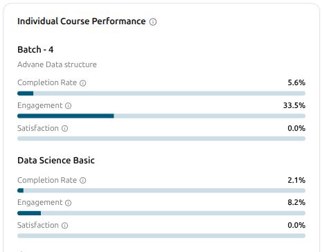
When the trend dips, the Individual Course Performance panel shows you which course pulled it down. Each course lines up with three bars — Completion Rate, Engagement and Satisfaction — so a course at 5% next to one at 33% tells you exactly where to look first.
Time Spent FAQ
What admins, founders and instructors ask when they treat time as a real metric.
Can't find what you're looking for?
Contact Sales

Start Building Learning Your Way
Set up courses, programs, and learning experiences without forcing your process into rigid software. A connected system for students, educators, and administrators.
Build Your Academy