
Three numbers for the catalogue,three bars per course
Course Performance opens with three KPIs across the whole catalogue — Avg Completion Rate, Avg Engagement and Avg Satisfaction — each with the change vs the previous month, plus a fourth tile showing how many programs sit in the high-performing bucket. Underneath, a six-month line chart traces completion against satisfaction. Below that, every program in your catalogue with its own three bars, scrolling-paged, scoped by the program filter and the date range you pick.
What's on the Course Performance page when you open it
Two questions drive the page. How is the catalogue doing as a whole — that's the four KPI cards across the top. Which programs deserve your attention this week — that's the per-program list at the bottom. The trend chart in between gives you the rhythm. Filters keep the view honest to whatever slice you actually care about.
Three Catalogue KPIs With the Delta
Avg Completion Rate, Avg Engagement and Avg Satisfaction — each with a percent change vs the previous month and a green or red trend arrow. Read the catalogue's health in three glances.
High-Performing Counter
A fourth tile reads X / Y — how many programs are pulling above the median against your full catalogue size. The bucket either fills up over time or it doesn't.
Six-Month Performance Trend
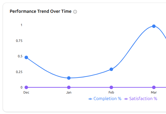
A two-line chart plotting Completion % and Satisfaction % across the last six months. When completion climbs but satisfaction drops, the chart names the disconnect before learners do.
Per-Program Bars That Name Names
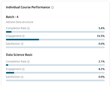
Every program in the catalogue rendered as its own card — title, parent program (when it's a cohort), and three progress bars: Completion Rate, Engagement and Satisfaction with one decimal of precision.
Program and Scope Filters
Multi-select programs to scope the whole view. Pick a course or learning path and the breakpoints and sections inside it appear as a content-scope filter, so you can read performance scoped to one week of one program.
Date Range, Optional
Pick a date range and the headline KPIs and the per-program list re-aggregate against it. Skip the picker and the page reads against the platform's full enrolled history.
Four headline KPIs across your catalogue, with last month's change
Know how your catalogue is doing in one glance. Avg Completion Rate tells you whether learners are finishing what they start. Avg Engagement tells you how invested they are along the way. Avg Satisfaction tells you whether they enjoyed it. High-Performing Courses surfaces the standouts — your X best of Y. Every card carries last month's change, so the direction lands before the number does.
Avg Completion Rate — are learners finishing what they start?
Avg Engagement — how invested are they while learning?
Avg Satisfaction — did they actually enjoy it?
High-Performing Courses — the catalogue's standouts at a glance
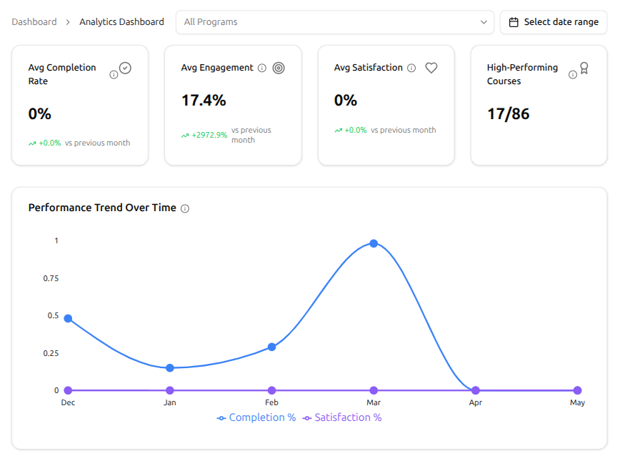
Six months of completion against satisfaction, on one chart
Two lines, one chart, six months of history. The Performance Trend Over Time view puts Completion and Satisfaction side by side so the story behind your numbers tells itself. Are learners finishing and loving it? Finishing but not enjoying? Loving the ride but not seeing it through? The shape of the two lines answers in seconds.
Completion % — how many learners actually finish each month
Satisfaction % — how happy they are along the way
Six months of history, side by side on the same chart
Hover any month for the exact pair of numbers
Every program, scrolling-paged, with three bars per row
Every course, learning path and cohort lines up in one list — three bars per row for Completion Rate, Engagement and Satisfaction. The cohort outperforming its parent course, the bundle quietly dragging, the path strong on satisfaction but weak on completion — they all surface at a glance, side by side.
One row per program — course, learning path or cohort
Three bars per row — Completion Rate, Engagement, Satisfaction
Spot the standouts and the stragglers in a single scroll
Cohorts show their parent course alongside
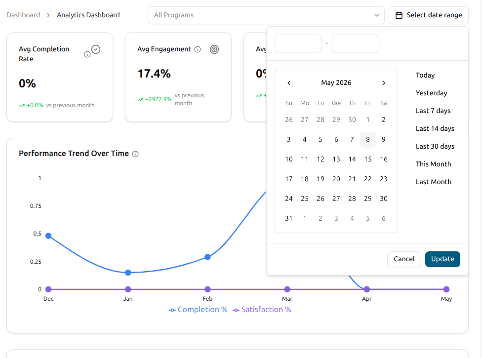
Filter to the slice that matters — and the whole page rescopes
Pick the program you want to focus on, pick the window you want to read, and the whole page reshapes around your question. KPIs, the trend chart and the per-program list all redraw together. One-click presets — Last 7 days, Last 30 days, Last Month — get you there without typing.
All Programs filter — scope to one program or the whole catalogue
Quick presets — Today, Yesterday, Last 7 / 14 / 30 days, This Month, Last Month
Custom start and end when the presets don't fit
Every KPI and chart rescopes to your selection
From a fresh open to a clean read on the catalogue
There's nothing to wire up. The page populates the moment your platform has enrolled learners — no setup, no cron job to wait for.
Open Course Performance
Jump to Course Performance from the admin's analytics area. Four KPI cards greet you up top — Avg Completion Rate, Avg Engagement, Avg Satisfaction and High-Performing Courses — each with a vs-last-month change. The Performance Trend Over Time chart sits right below.
Read each course on its own three bars
Scroll the Individual Course Performance list. Every course, learning path and cohort gets three bars — Completion Rate, Engagement, Satisfaction — so the program with high completion but weak satisfaction stands out next to the one that's the other way around. The picture is the read.
Read the trend and decide what to fix
Step back to the Performance Trend Over Time chart. Are completion and satisfaction climbing together? Has one of them broken away from the other? A flat completion line with falling satisfaction means content is delivering but the experience isn't. The shape of the two lines tells you what to fix next.
Course Performance FAQ
What founders, admins and program managers ask the first time they sit down with the catalogue's numbers.
Can't find what you're looking for?
Contact Sales

Start Building Learning Your Way
Set up courses, programs, and learning experiences without forcing your process into rigid software. A connected system for students, educators, and administrators.
Build Your Academy