
Who's finishing, who's still moving,who hasn't started
When a stakeholder asks how the platform is doing, completion is the first answer that lands. The Completion Analytics page opens with four KPI cards — Overall Completion, In Progress, Not Started, Time to Complete — each with a percent change against the previous period. Underneath sits a three-line progression chart, a by-level breakdown across Beginner, Intermediate, Advanced and Expert, and a Recent Completions card naming the people who just crossed the line.
What's on the page when you open it
Completion reports earn their keep when the answer is one screen away, not three exports deep. The page puts the four headline numbers at the top, the weekly trend underneath, the difficulty-level breakdown next to it, and a list of the learners who just crossed the line, so a board update is a screenshot, not a project.
Four KPIs Across the Top
Overall Completion, In Progress, Not Started and Time to Complete — each with the percent change vs the previous period and a trend arrow, so the read lands before the number does.
Weekly Completion Progression
A line chart with three series — Completed, In Progress, Not Started — plotted week by week. The shape tells the story of where in a course people stall, and the long tail of stragglers becomes visible.
Completion by Difficulty Level
A bar chart breaking completion across Beginner, Intermediate, Advanced and Expert. Spot the level where the curve gets steep — the place to invest in remediation or reset expectations.
Recent Completions
A live list of the learners who just finished — student name, course title, completion date. Useful for cohort shout-outs, certificate handover and giving the moment a face.
Date Range Picker With Compare
Pick any window and the whole page rescopes. The Compare switch surfaces the previous-period numbers on every KPI tile, so 'how are we doing this term vs last' is a single click.
Tied to the Real Completion Engine
Completion isn't a vibe — it's the enrollment status flipping to completed when a learner clears the program's curriculum and assessment thresholds. Certificates fire off the same event, so the completion you read in the report is the completion the learner gets credit for.
The four numbers stakeholders always ask for
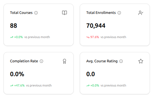
When someone walks in and asks "how are we doing?", these are the four answers. Total Courses tells them how big your catalogue has grown. Total Enrollments tells them how many seats you've filled. Completion Rate tells them whether learners are finishing what they start. Avg. Course Rating tells them whether they liked it. Every card carries last month's change with a green-or-red arrow, so the direction lands before the number does.
Total Courses — how big the catalogue has grown
Total Enrollments — how many seats are filled
Completion Rate — are learners finishing what they start?
Avg. Course Rating — how your audience actually receives it
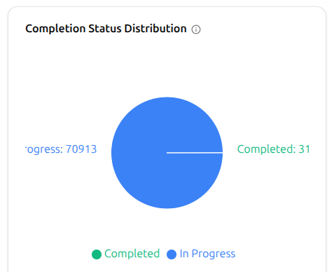
Where every enrollment stands, in one slice
The Completion Status Distribution chart splits every enrollment into two clean slices — In Progress and Completed. The blue wedge tells you how many learners are still on the journey; the green slice names how many have crossed the finish line. One picture, one read — no spreadsheet, no math.
In Progress slice — learners still on the journey
Completed slice — learners who crossed the finish line
Exact counts shown alongside each slice
Updates live as new enrollments and completions land
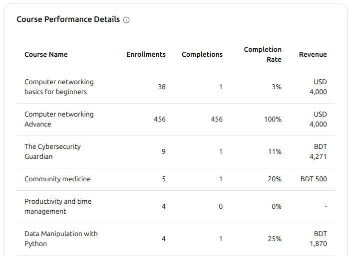
Where in your catalogue does completion really happen?
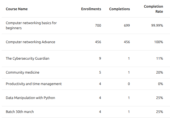
The Course Performance Details table answers it course by course. Every program lines up with its Enrollments, Completions, Completion Rate and Revenue, side by side. The course sitting at 100% next to one at 3% tells you exactly which programs are working — and which ones need a closer look.
One row per course across your whole catalogue
Enrollments, Completions, Completion Rate and Revenue per course
Spot the standouts next to the ones quietly dragging
Revenue tied to each course for a quick commercial read
From a dashboard glance to a stakeholder-ready read
There's nothing to wire up. Completion is tracked the moment a learner's enrollment status flips to completed, and the page is ready as soon as you have learners moving through programs.
Open Completion Analytics
Jump to Completion Analytics from the admin's analytics area. Four KPI cards greet you up top — Total Courses, Total Enrollments, Completion Rate and Avg. Course Rating — each with a vs-last-month change and a green-or-red arrow.
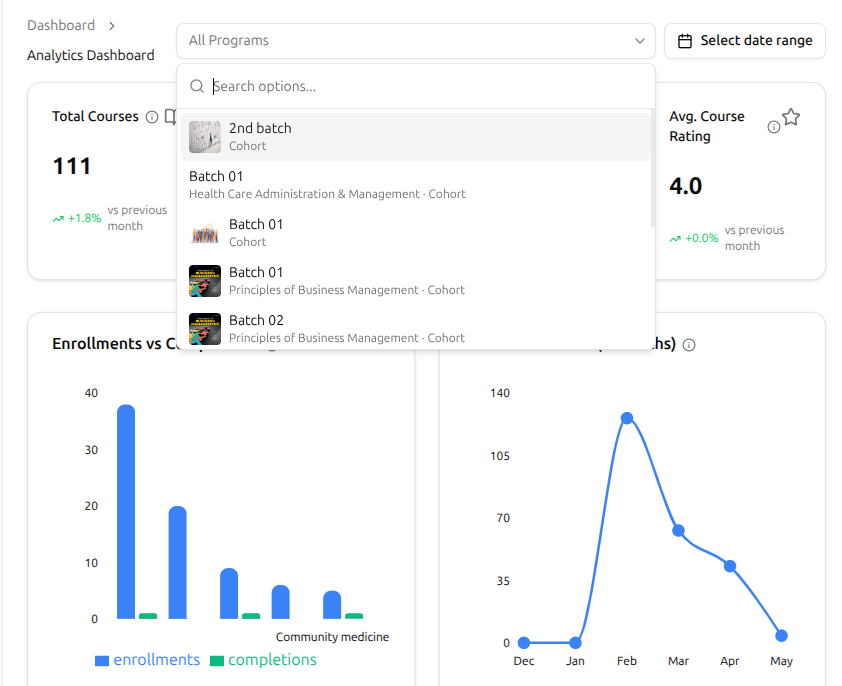
Pick a program or cohort, scope the page
Use the All Programs filter at the top to scope the whole page to a single course, learning path or cohort. Type to search, pick the one you want, and every KPI and chart redraws to that selection — so reading "how is Batch 02 actually doing?" is one click, not a spreadsheet.
Sort by completion, find your top performers
Sort the Course Performance Details by Completion Rate and the courses doing the heavy lifting rise to the top. The course with 700 enrollments and 699 completions is the format that's working; the one sitting at 0% is where to step in next. Names, numbers, next actions — in a single scan.
Completion Analytics FAQ
What admins, founders and accreditors ask the first time they sit down with the completion view.
Can't find what you're looking for?
Contact Sales

Start Building Learning Your Way
Set up courses, programs, and learning experiences without forcing your process into rigid software. A connected system for students, educators, and administrators.
Build Your Academy